Mobile view coming soon!
Please view this project on a screen larger than 1120px wide.
During this project, I led multiple design feedback sessions and collaborated cross-functionally with designers, stakeholders, and project managers from NESN, as well as software engineers, designers, and project managers from two separate third-party vendors (one for iOS, and another for Android) that were contracted to build our apps.
This was a huge accomplishment to keep everyone on the same page despite coming from three different companies and different teams within each company in order to launch a product that was consistent across multiple devices and platforms. It took constant communication and daily check-ins. I felt like part-designer, part-project manager.
Reflection: Communication was key
Since TV playback and remote interactions was a brand new avenue for me, I dug through a lot of streaming apps to determine best practices, find common patterns, and discover interaction models that could help me improve the NESN 360 streaming app.
Hulu and YouTube TV were two of the many examples in my competitor analysis that offered an intuitive DVR playback experience with a clean, easily digestible interface.
Discovering industry standards
While starting to ideate and explore potential design solutions, I started with solving the problem of making the remote control interactions more intuitive and clear.
I wireframed screens and immediately started to prototype flows for the actions and journeys a viewer could take.
Users can play, pause, rewind, fast-forward, restart a game from the beginning, and catch up to the live point if they weren’t already. Those were basic functions.
Some of the advanced functions and considerations included:
Overlay background - how dark should the gradient be in order for the elements to be readable (including accessibility)? Also, how long does the overlay appear before fading away if not interacted with?
Quick actions - a tap left or right should move the playback in 10-second increments, saving users time rather than manually trying to scrub. But, should that “tap” first bring up the controls overlay, or just move the video? And, does the video pause or remain playing during these actions?
Rewind/FF leveling - long pressing activates a full on fast-forward or rewind action. Then users are allowed to tap left or right to speed up and/or slow down the speed to help them more accurately pinpoint their desired destination in a show (available scrubbing duration could span hours).
CC subtitles - during an active overlay with playback controls, where do the subtitles sit on the screen so that they’re still viewable?
My approach was to focus on the interaction design first


Prototype of an early iteration conveying the quick 10-second tap interaction.
Key Learning: This documentation was a huge hit! My cross-functional teammates greatly appreciated and thanked me for making it easier for them. I learned that going the extra mile like this when communicating only increases team morale, saves time for all, and leads to less mistakes/bugs in the original code.
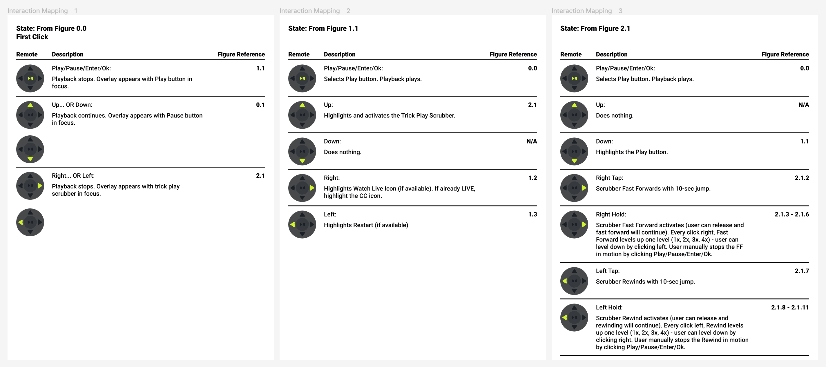
At this point, I needed to further communicate the functionality parameters to third-party engineers and PMs so that they could clearly understand all of the possible interaction flows between the user and the remote, and develop it as intended.
Crafting a user manual for clearer communication
Early version snippet of the user manual I crafted to communicate interactions more effectively. Includes remote diagram, description of what happens, and reference mappings of screens to refer to that align with each action.

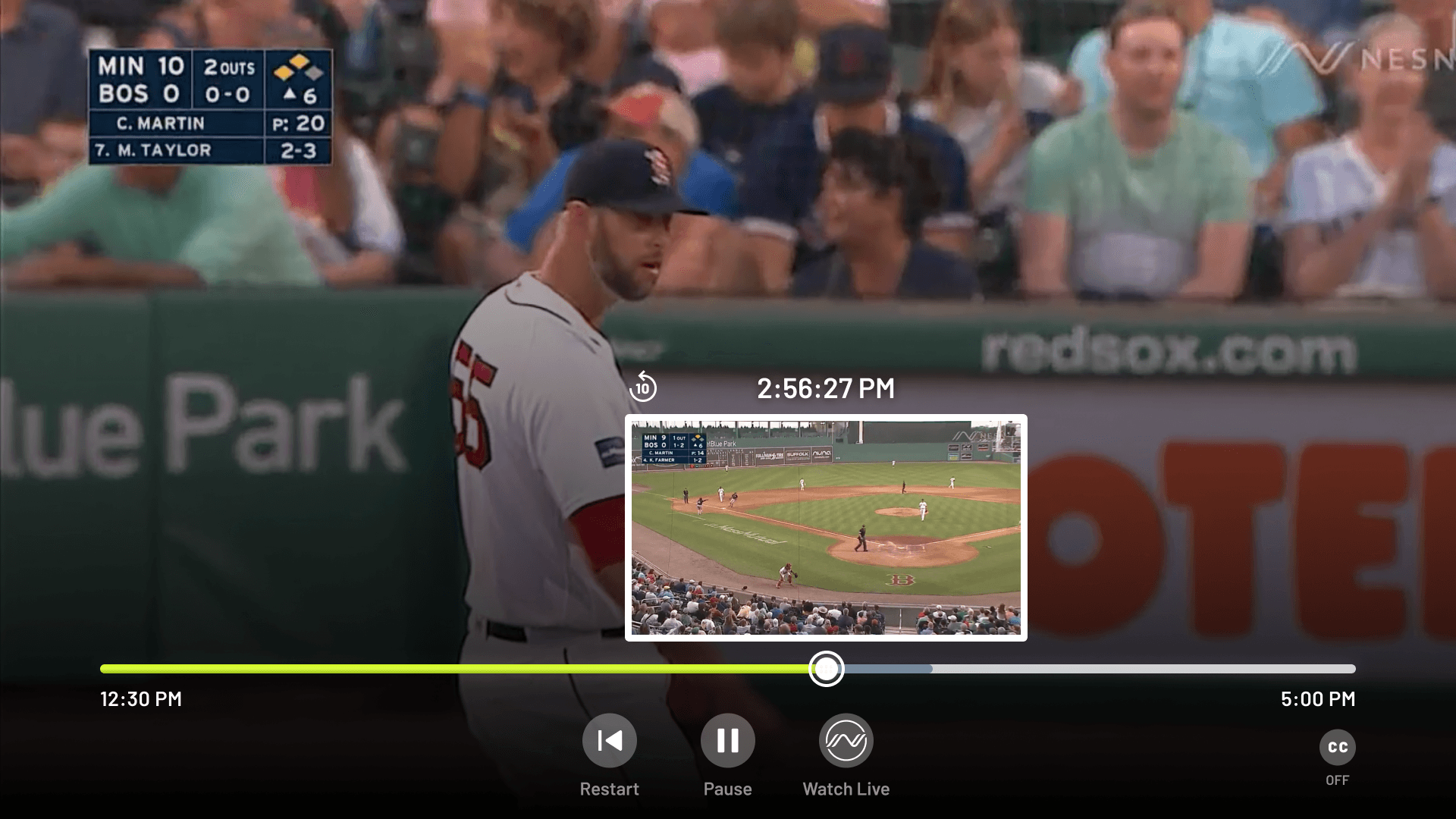
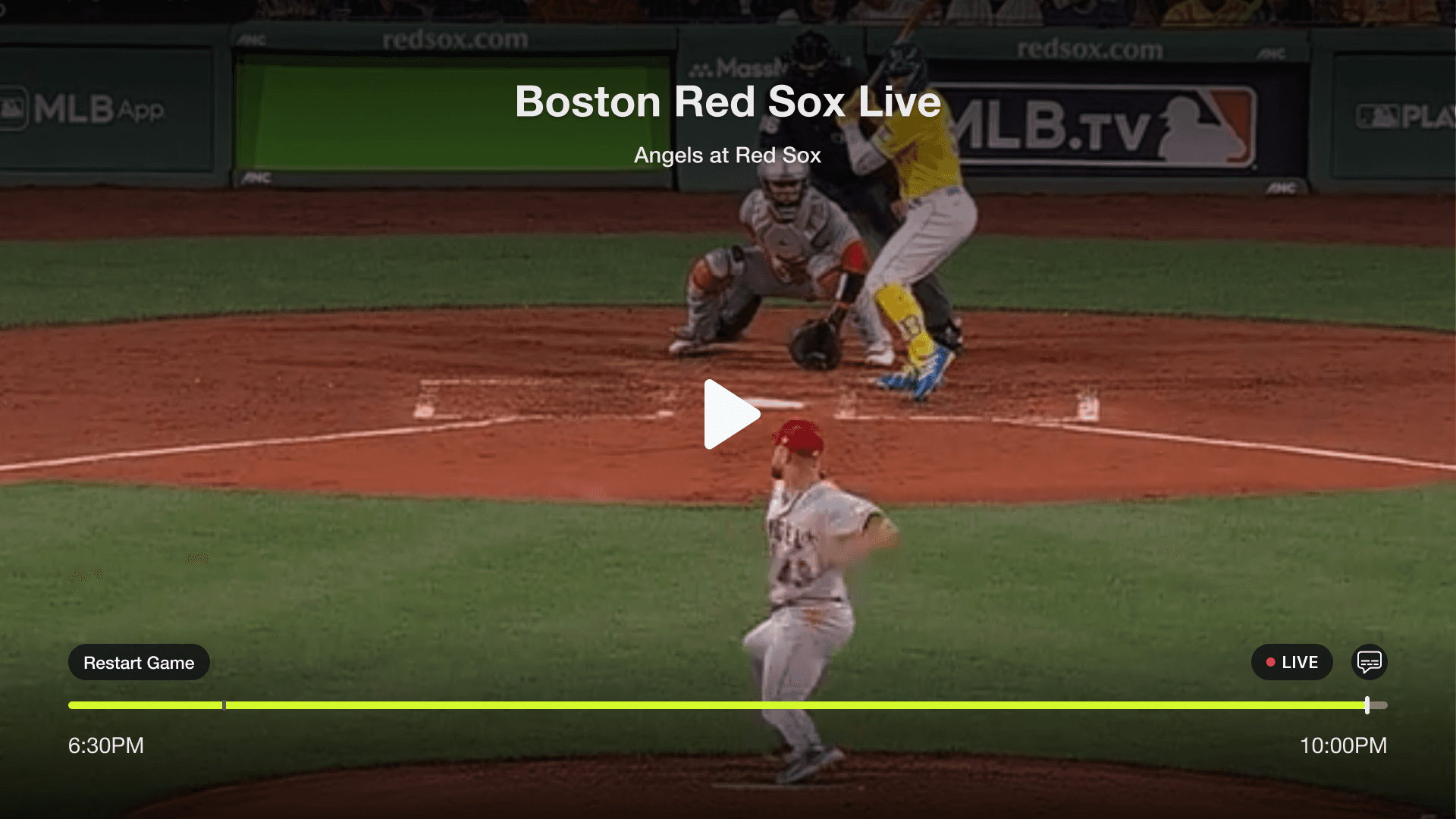
Updated NESN 360 DVR playback controls interface.

Before
After
The last step was to send the new visual designs to the engineers which updated the interface’s layout and visual design to make it more clear for a user to understand where they are on the screen.
Main updates included:
Repositioning of program and title name (along with rules and states for the edge cases of having really long names)
Adjusting the colors for the scrubber (more vibrancy, clearer separation between playback bar, buffer bar, and duration bar)
Updated buttons and icons
Branded font
Added controls for Restart, Play/Pause, and Watch Live/You’re Live
User feedback results: new design leads to higher satisfaction
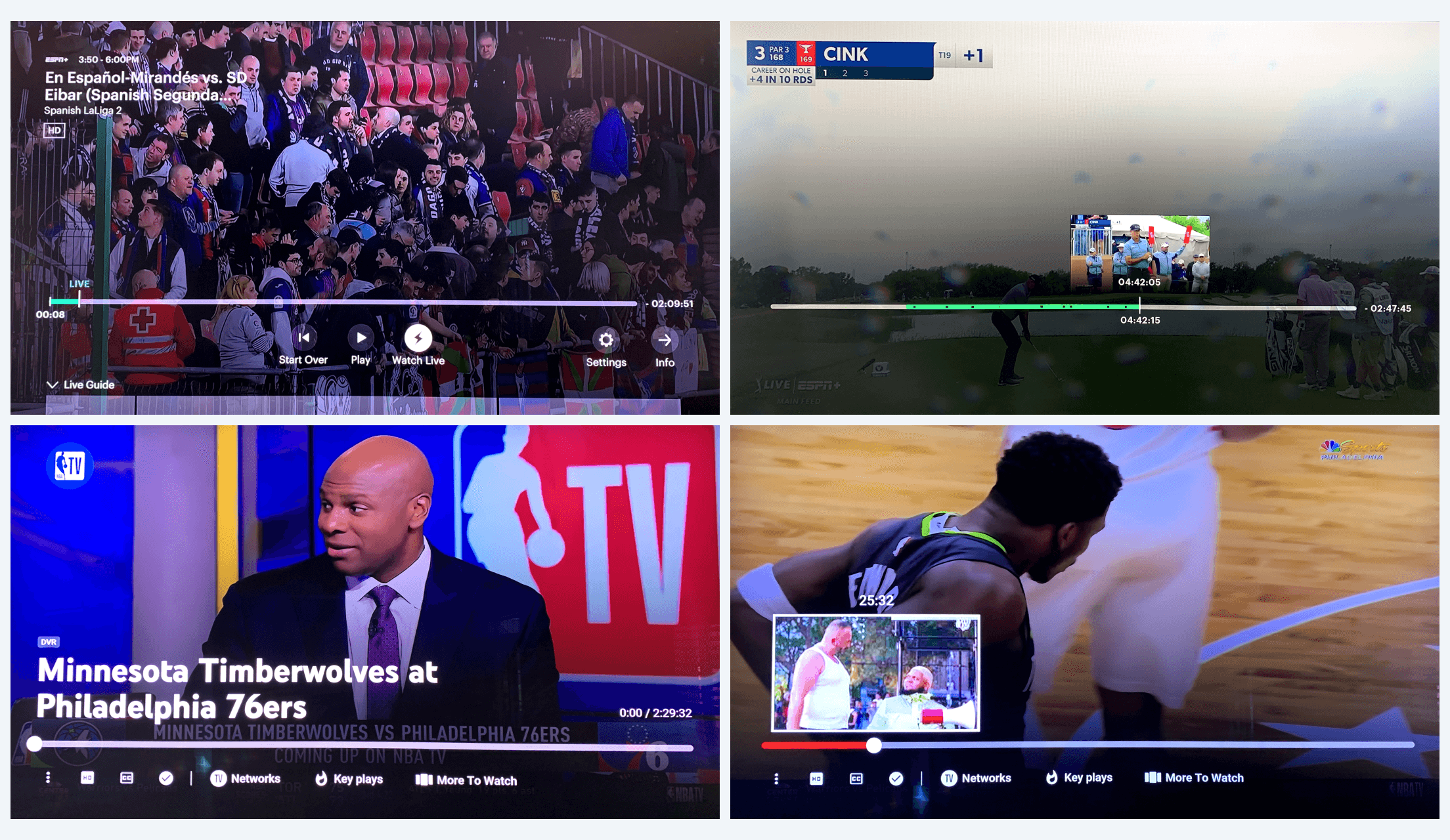
(Hulu Live TV and YouTube TV) Notice how when the scrubber is active, other elements are removed to allow the user to focus on their main action of scrubbing.

Wireframe prototypes with labeled walkthroughs. I also included diagrams of pictured remote controls to help visualize the corresponding actions.

I focused on parity when carrying over the TV design to the mobile interface, as well as improving the usability. So, this meant consistent icons, clear controls, and updating the look to be consistent and on-brand.
Spacing for tap targets was a big focus. Everything has at least a 48px tap area (accessibility minimum) for users to tap confidently and avoid human error as much as possible.
Another focus was keeping the main controls in the middle of the screen, as they are the primary actions the user will typically use.
Updates were scaled to mobile platforms
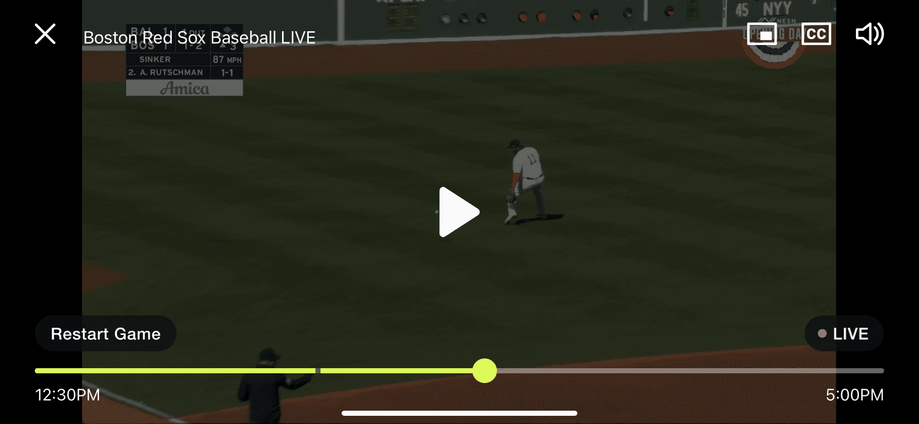
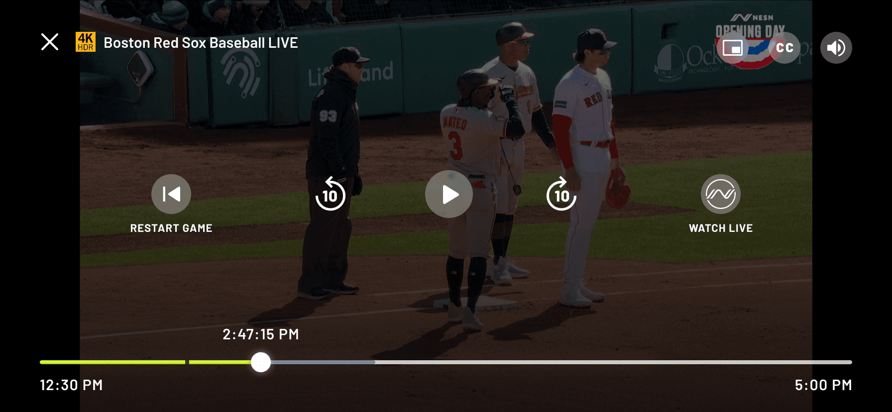
Before
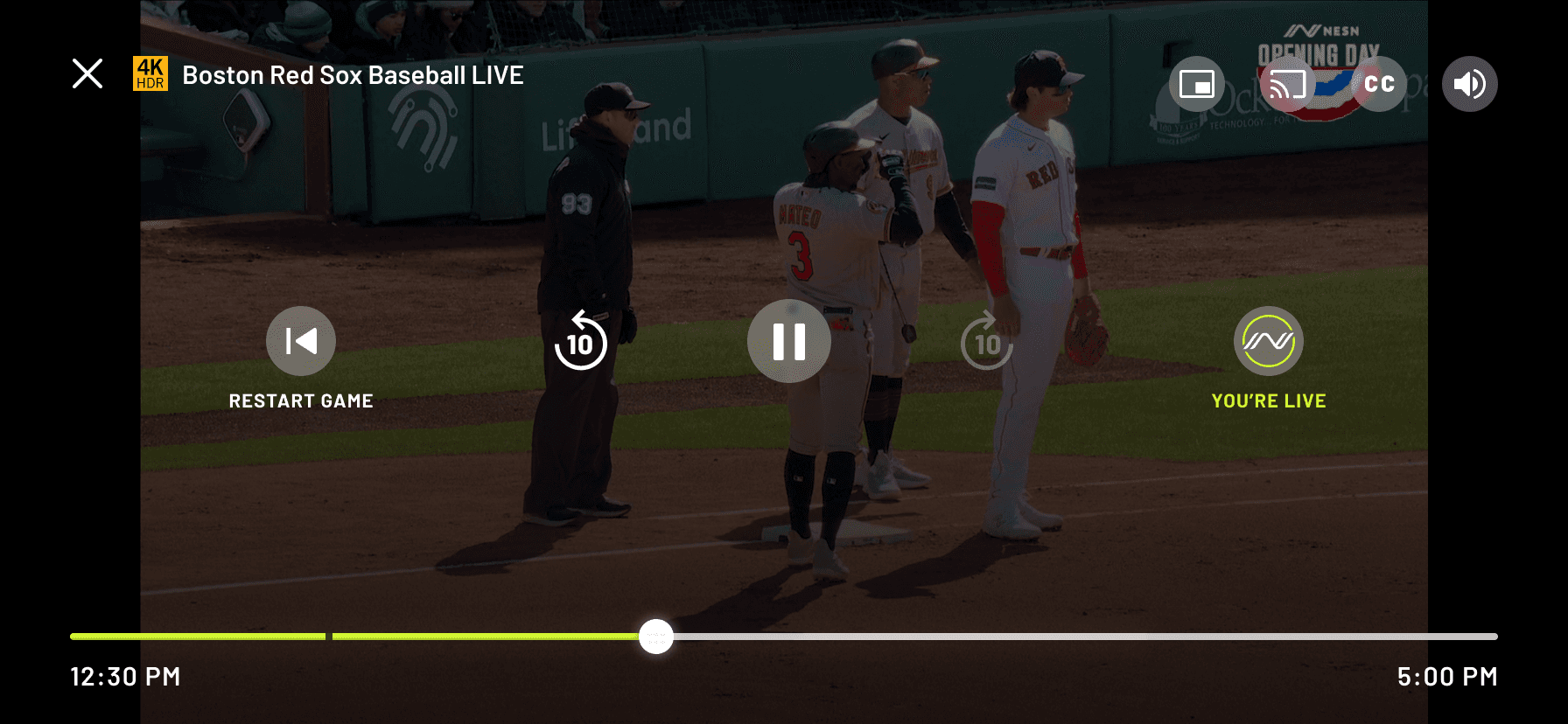
After
User feedback led to us changing the overlay duration from 5 seconds to 3 seconds if not interacted with.

When a viewer is live, 10-second fast forward jump is disabled.

Our third-party vendor released a beta version of DVR. This is the overlay controls interface for TV platforms.
To get a feel of what the main issues were, I led a round of user interviews with internal employees who were far removed from the design team (like sales, video coordinators, etc.) to get feedback. The goal was to determine three main things:
Does the user understand what the DVR feature is and what are their expectations when using it?
Can they figure out how to use DVR easily and intuitively?
What are the major pain points?
Results of testing confirmed that the DVR feature was very difficult to understand.
Main findings and areas needed for improvement:
We needed a clearer way to present the options to users (such as play/pause, fast-forward, rewind, restart, join live, toggle closed captioning).
Users could not easily figure out how to activate the scrubber element to manually scrub through time.
Playback time duration was very confusing.
Using the remote did not act as intended (users were often lost on the screen).
Visuals and layout in general could be improved and include better branding.
User research helped confirm common pain points
The original version that our third-party vendor launched as a beta wasn’t intuitive at all. There were no indicators on the screen that communicated to the user the focus state of the remote. Information was place all over the screen, so it was hard to get all the information needed at once.
Buttons and status pills looked the same, therefor the user was left guessing about what elements were interactive. And the duration of time on the timestamp while scrubbing was formatted in a confusing way (counting hours backwards).
Uh-oh! Beta version shortcomings
The goal of this project was to increase user satisfaction through fixing our DVR feature by making it easier to understand and use.
From a business impact point of view, our direct-to-consumer subscribers pay $30/month and expect to have a premium product that works properly and is easy to use. By satisfying their needs, the company will be more likely to keep them as paying customers.
Goal: Satisfy users to retain them as customers
We launched a beta version of DVR (the most requested feature from our users) for our NESN 360 streaming app through a third-party vendor, but when stakeholders tested it internally, they thought it was a really clunky experience and needed major fixing.
I volunteered to take the lead on this project of improving the visual interface and interaction models for mobile and TV platforms.
Overview: I led the DVR redesign
Lead Designer
Role
Mobile iOS, Mobile Android, TV iOS, FireTV, Android TV, Roku TV
Platforms
Wireframes, UI Screens, Prototypes, Interaction Control Maps/User Flows, Research
Deliverables


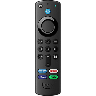
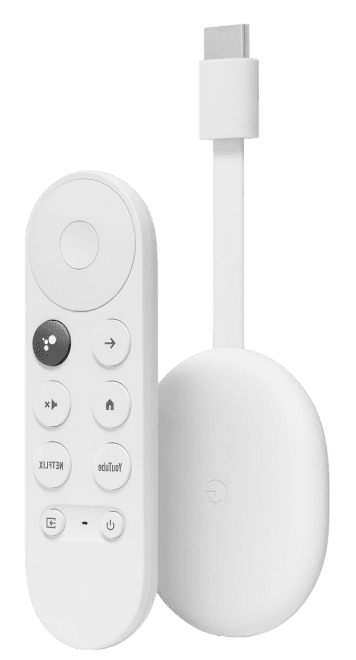
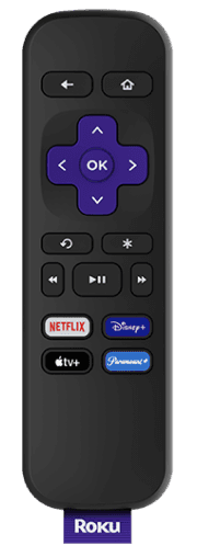
DVR playback refers to a user’s ability to stream live games with the additional options to play, pause, fast forward, rewind, and restart from the beginning, or join live-in-progress during a live stream.
Improving the Interface and Usability of DVR Playback Controls
2023
NESN