Mobile view coming soon!
Please view this project on a screen larger than 1120px wide.
User Interface Designer
Role
Figma, Zeroheight
Platforms
Component Library, UI Kit, Documentation
Deliverables
By creating a Design System, our team saw increases in efficiency and consistency across our designs, and removed the back-and-forth between our design team and other cross-functional departments within our organization.
As co-lead designer, I organized existing elements across our designs, created new components (and variants), and designed dynamic templates for our design team, third-party vendors, other departments to use. I worked cross-functionally with designers, engineers, stakeholders, marketing, and copywriters to ensure this project would benefit all parties.
Saving 30 hours per week with new design system
2019
HomeServe
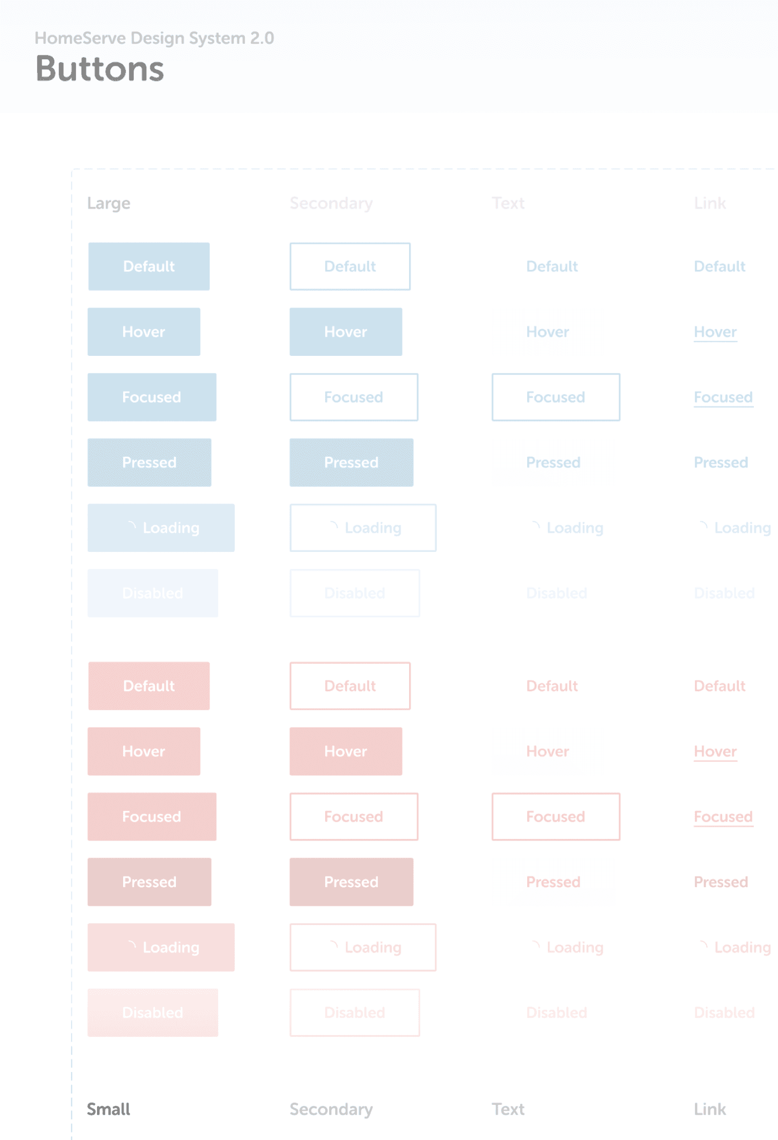
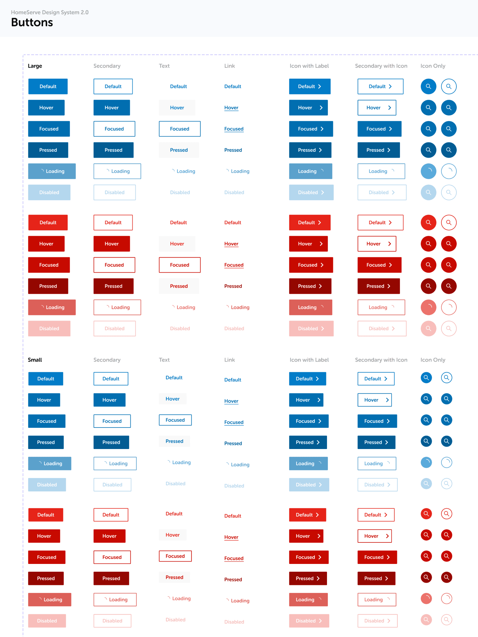
Buttons are one of the most common components, and also one of the most important. They are call-to-actions that lead users to the next step in their journey.
I took the existing button from our style guide and built out the many different states that we would need across mobile app, mobile web, and desktop web. Some of these states include default, hover, focus, and loading, among others.
Buttons
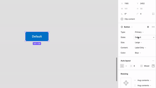
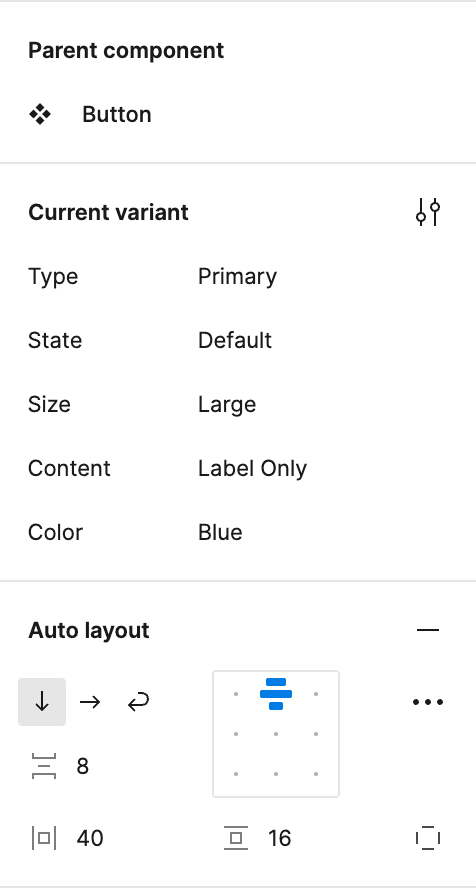
Example buttons, component sheet, and snippet of variant options with auto layout functionality.
Primary
Secondary
Link
Icon with Label
Secondary with Icon
Icon Only
Default
Default
Default
Default
Default
Default Examples
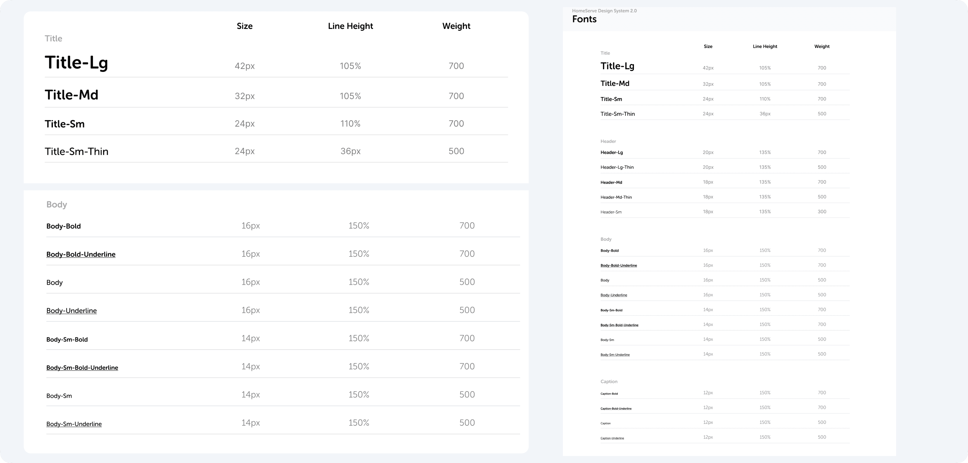
Another foundational piece to any design system is the typography. Our brand uses Museo Rounded, but we needed to clean up all the size discrepancies that lived on the different pages. There were a lot of type elements across our products that didn’t match each other, so this new consistency was really beneficial moving forward.
I tried to stick to a naming convention that could easily be updated as needed. So, rather than using a value in the name, for example Title-42, I decided to use a size, like Title-Lg.
This way, we can easily update the value, say from 42px to 48px, and the name will always remain!
Typography
Typography style sheet.
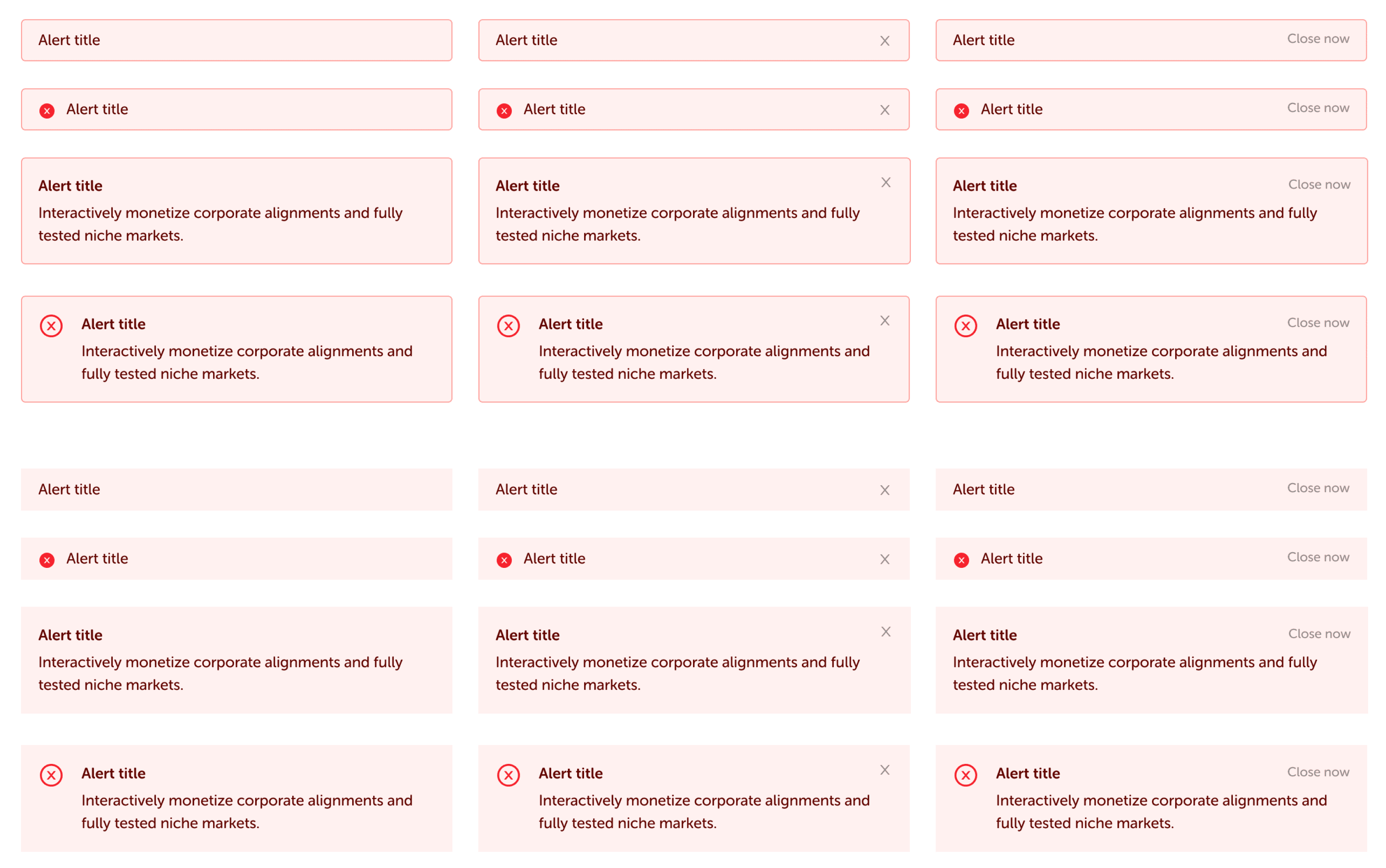
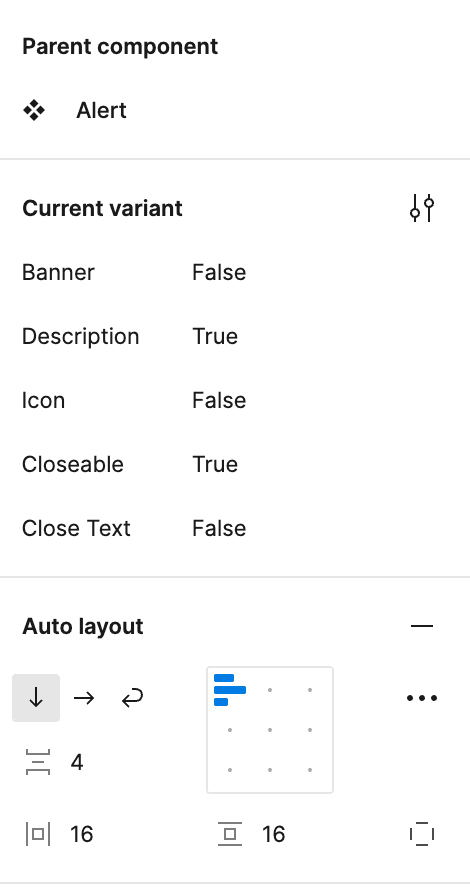
We were dealing with a lot of alerts and banners in our workflow and, since our design team was small, I put together a fully customizable alert box component – complete with auto layout so this alert box could be stretched full screen if need be.
It works for all platforms.
We probably didn’t need this many variations, and if I went back in time, I probably would have cut some of these out.
Nonetheless, this made designing for new instances much quicker. The customization abilities allows for a little more designer freedom, which worked for us.
Fully Customizable Alert Box Component
Alert Box component sheet and variant selections.
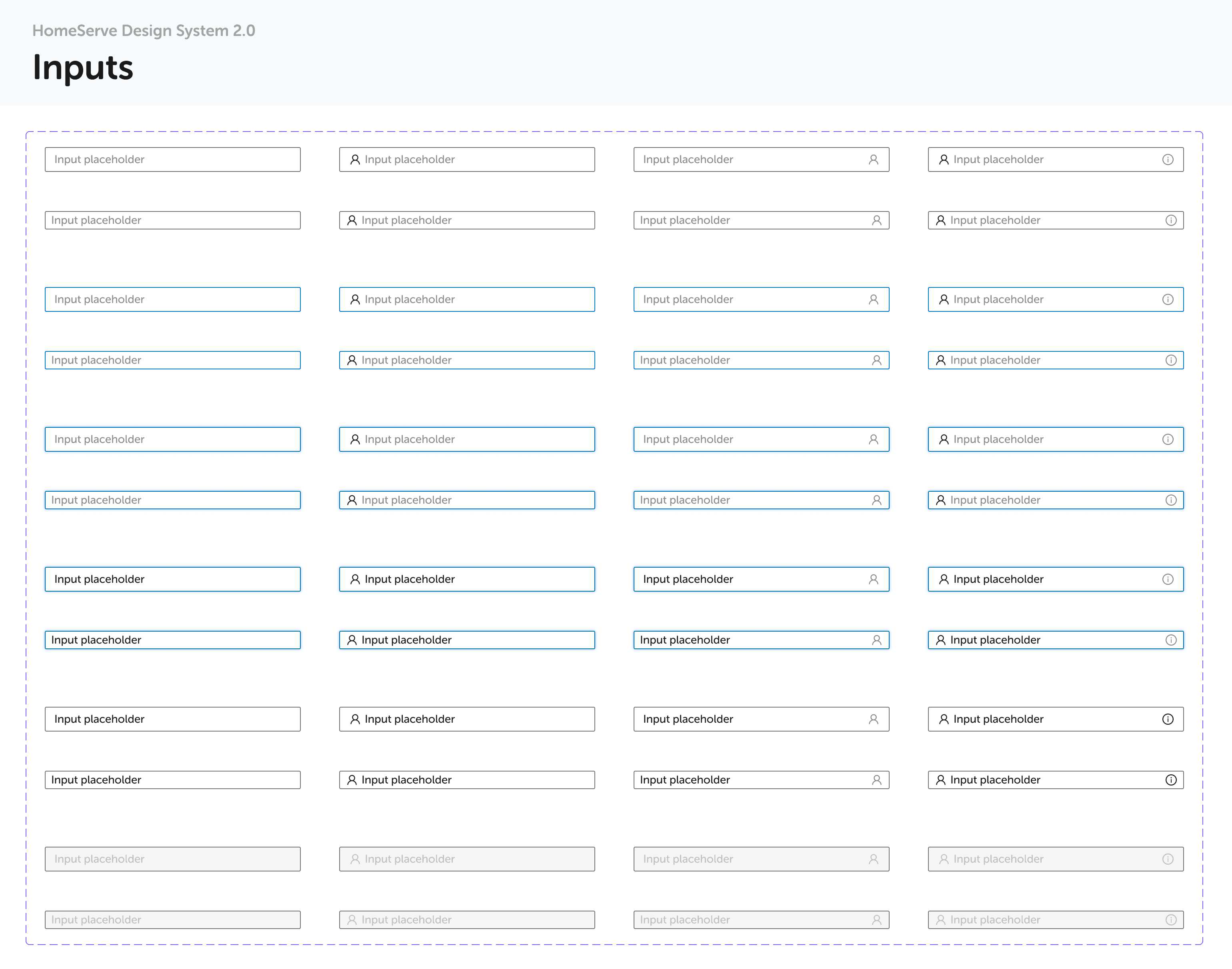
There are a lot of different states for input fields! We needed to make sure we conveyed clarity throughout the user’s journey, from default to focus states, and everything in between.
For us, we have a default state with no text, a default state with text input, hover state, focused state, focus state while a user is typing, and a disabled state.
Within these, there are options for size large or small, and options for multiple placements to include icons.
Input Fields
Sticker sheet overview of our Input components.
Input placeholder
Input placeholder
Input placeholder
Focused State / User Typing Active
Default
Prefix Icon
Suffix Icon
Input Field Examples
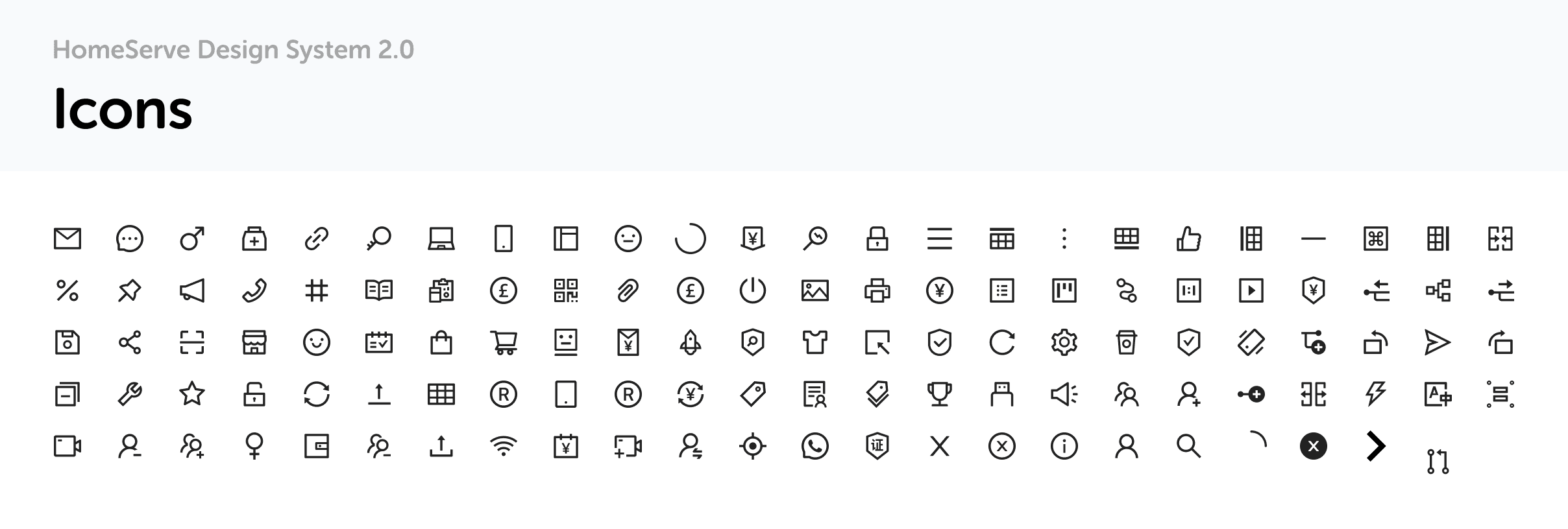
Here are a few of the other components I worked on while I was helping lead the launch of the design system at HomeServe.
More Components...
More components with variants and how they’re used in Figma.
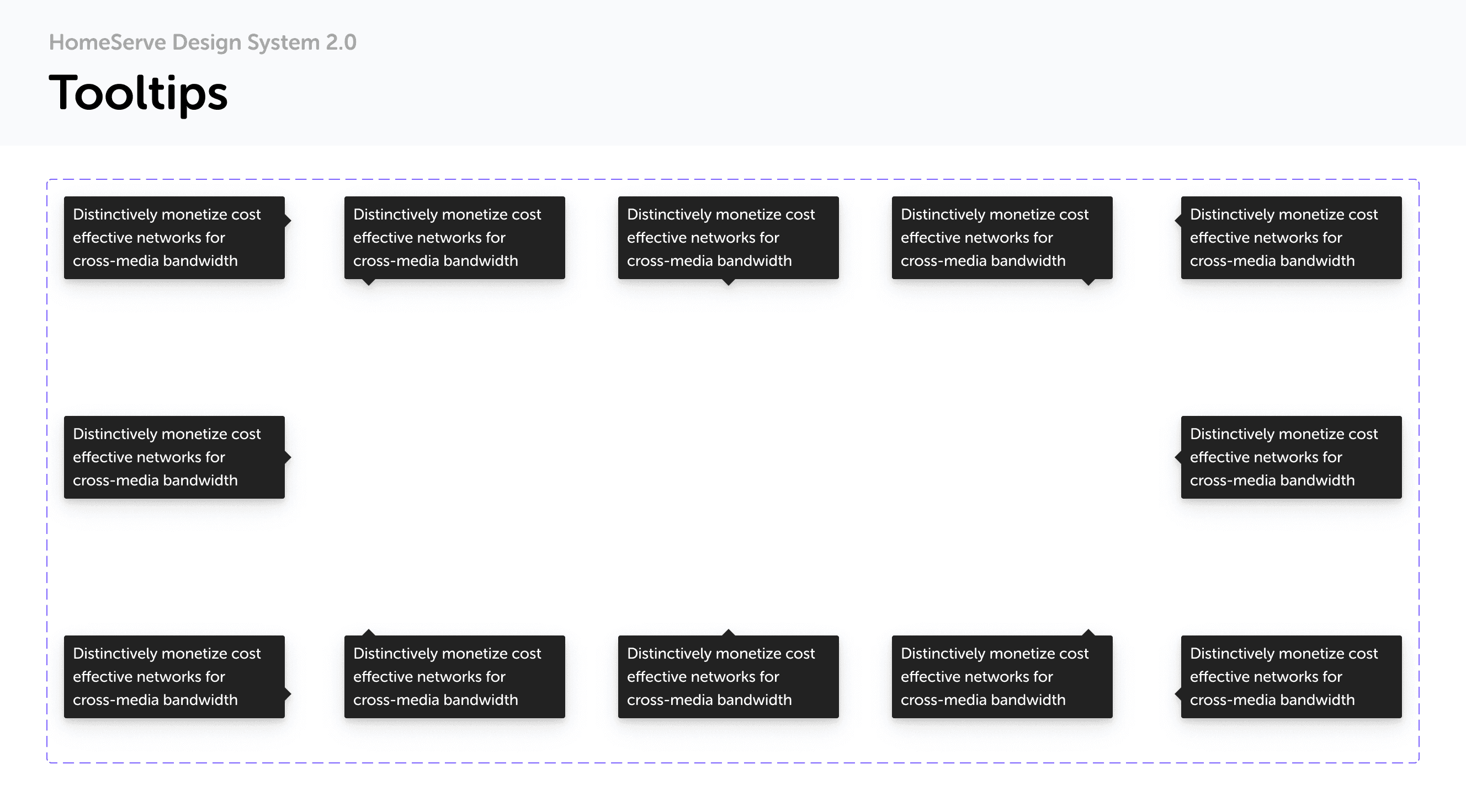
Distinctively monetize cost effective networks for cross-media bandwidth
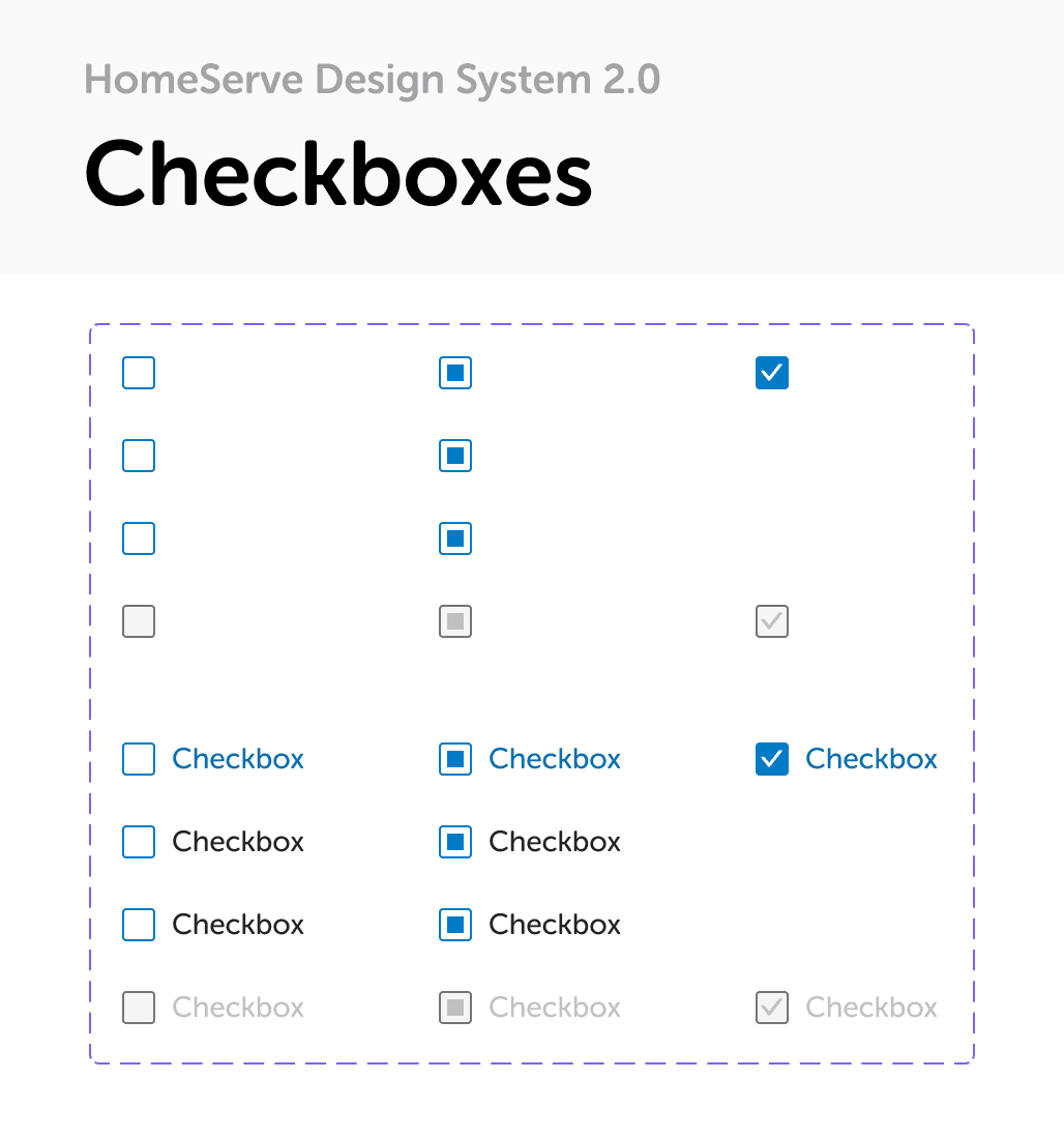
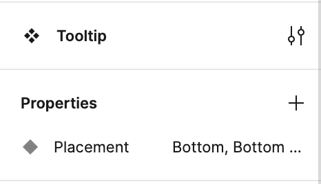
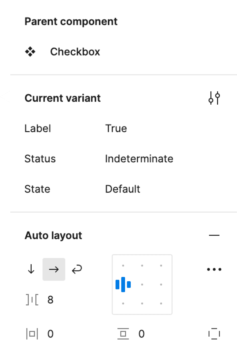
Checkbox
One of the main benefits we saw from developing and launching the design system – beyond faster, more efficient design and code – was that I was able to create templates that cross-functional partners could utilize themselves.
This allowed a copywriter, for instance, to take a template in Figma and write the copy, as well as A/B test different headlines, form fields, button copy, etc. seamlessly! Since we were putting out 80+ articles per week and constantly A/B testing copy on our funnel pages, this saved us (designers) hundreds of hours throughout the month!
The Benefits Extended Cross-Functionally
Demo of auto-layout template for a form that XFN partners could easily do themselves within Figma after a quick training session!