Mobile view coming soon!
Please view this project on a screen larger than 1120px wide.
Lead Designer
Role
iOS Mobile
Platforms
UX Prep Docs (Brainstorming, Sketches, etc.), Wireframes, UI Screens
Deliverables
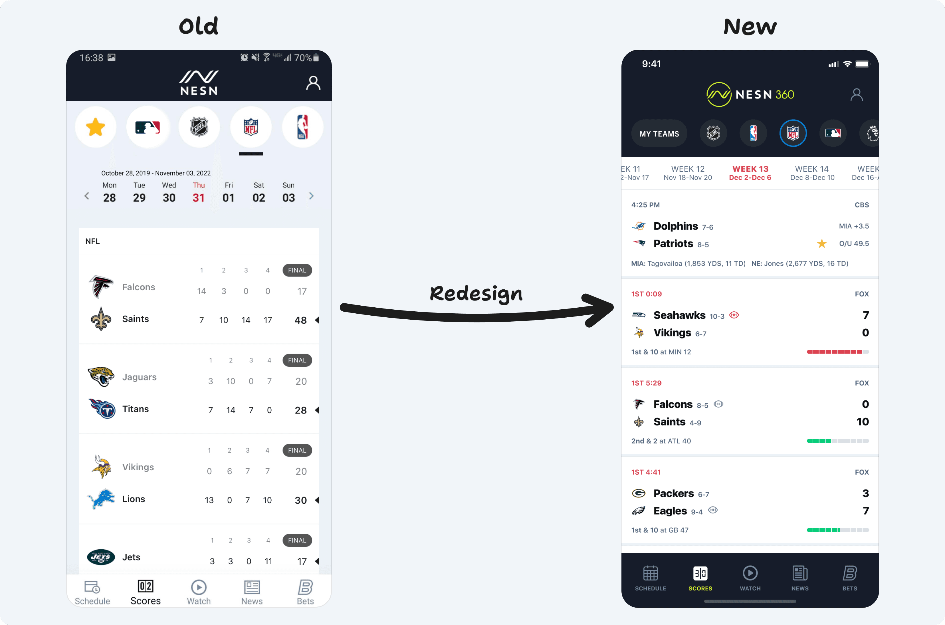
The existing Scores tab on our mobile platform is loaded with clunky UI, hard-to-use navigation, and the data is presented in a very confusing and non-useful way. In short, everything about it can be improved – and that’s where this redesign comes into place.
This project is currently in the queue to ship in a future release.
Redesigning the scoreboard on mobile
2022
NESN
Orioles 5-31
2
Red Sox 20-15
11
Bot 6th
NESN
AB: Story (2-3, .267 AVG)
P: Zimmerman (5.67 ERA)
1-1, 2 Outs
PHX -7.5
O/U 219.5
Suns 41-13
Lakers 28-25
10:10 PM
ESPN
PHX: Booker (28.6 PPG)
LAL: James (30.8 PPG)
LIV -2.5
O/U 3.5
Liverpool 21-2-6
Watford 6-19-4

7:30 AM
USA
LIV:
WAT:
W
W
W
W
W
W
L
L
D
L
Bruins 29-10-7
2
Flyers 21-15-10
4
Final
PHI +0.5, Over 5.5
PHI: Atkinson
BOS: Pasternak
PHI: Konecny
Dolphins 7-6
7
Patriots 8-5
17
2nd 10:42
CBS
2nd & 1 at MIA 32
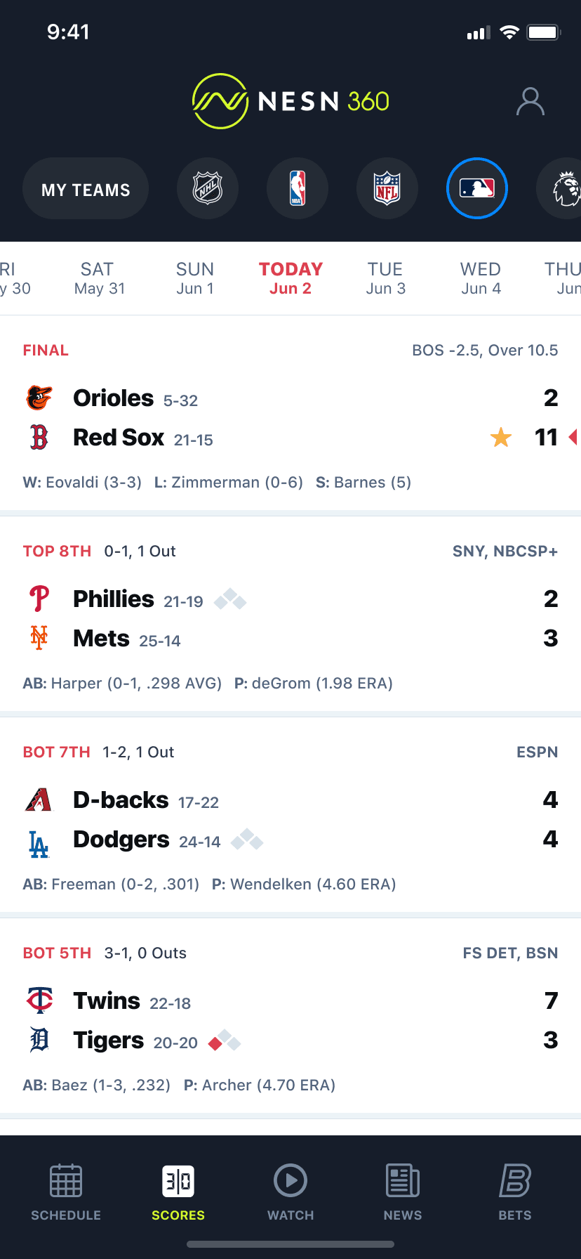
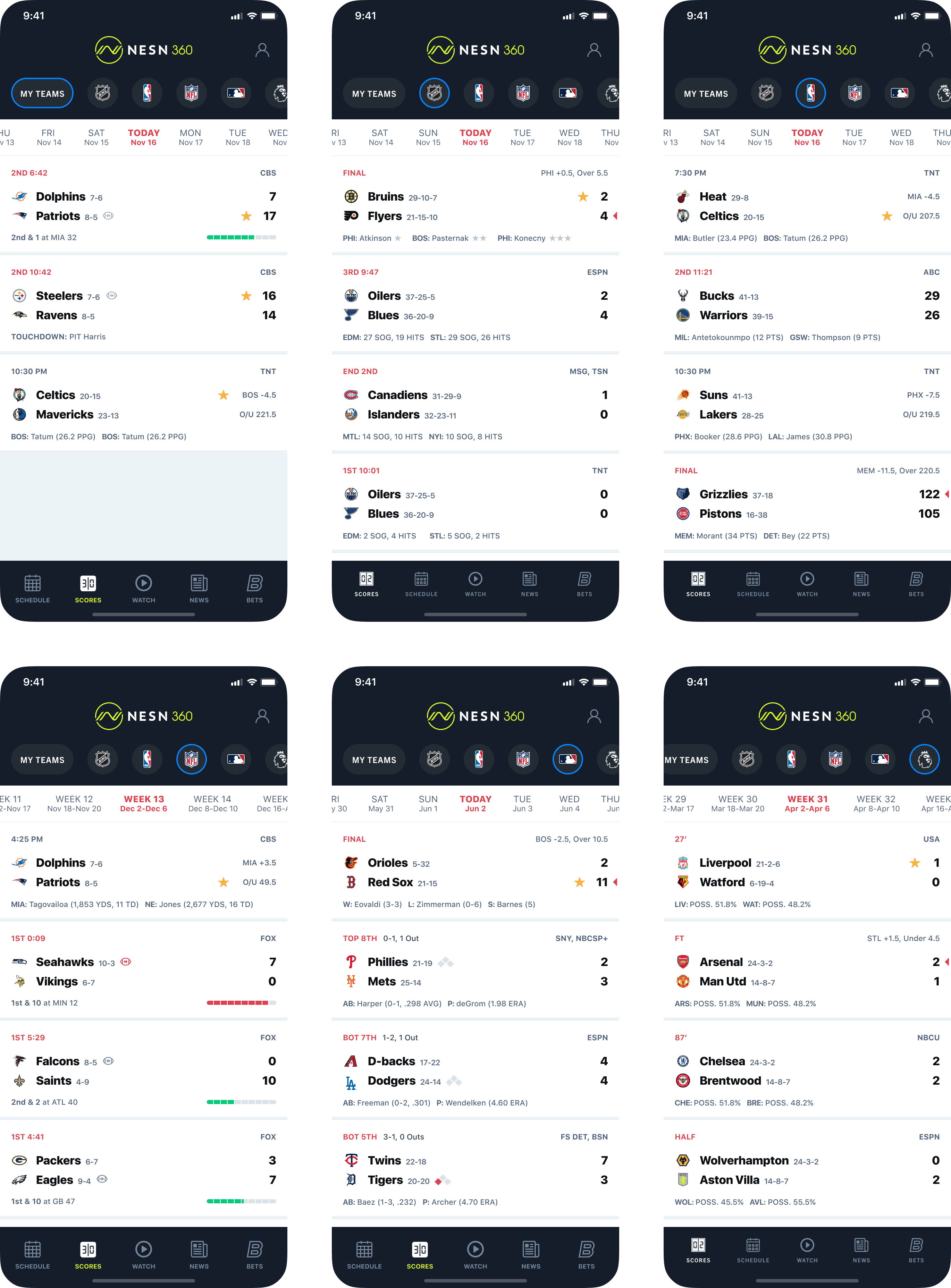
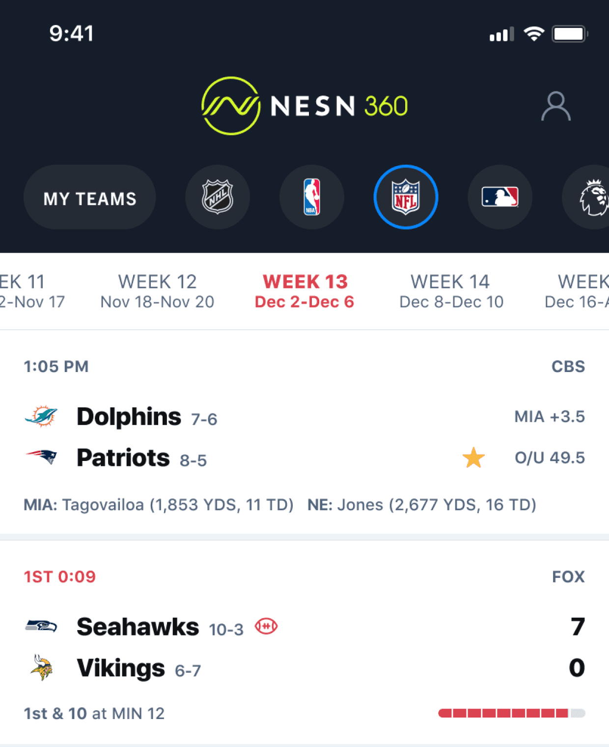
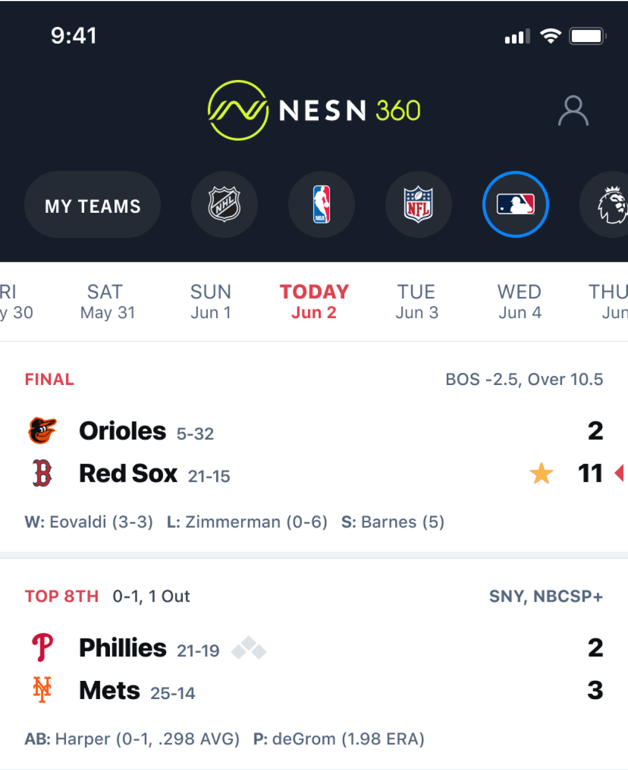
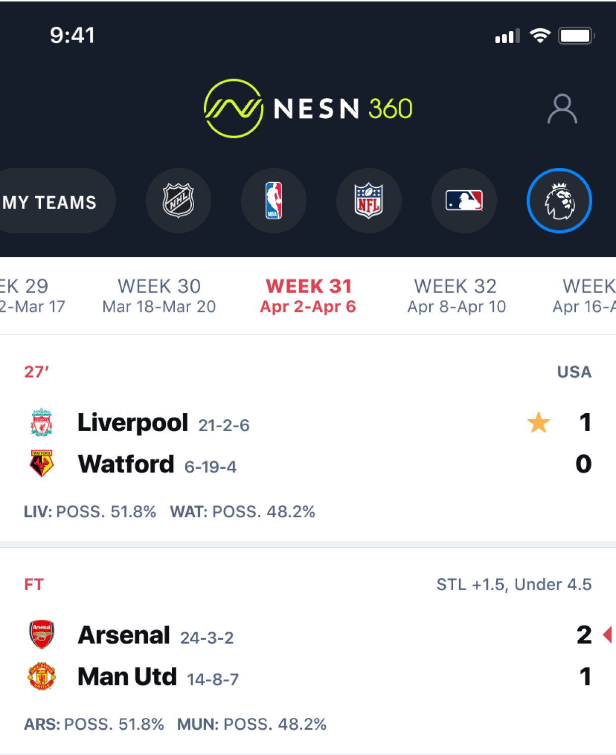
Some leagues go by day-to-day, like NBA and MLB. Other leagues like the NFL and Premier League go by a weekly schedule – so it made sense to have our date picker match this same logic to resonate with the pattern that fans are familiar with.
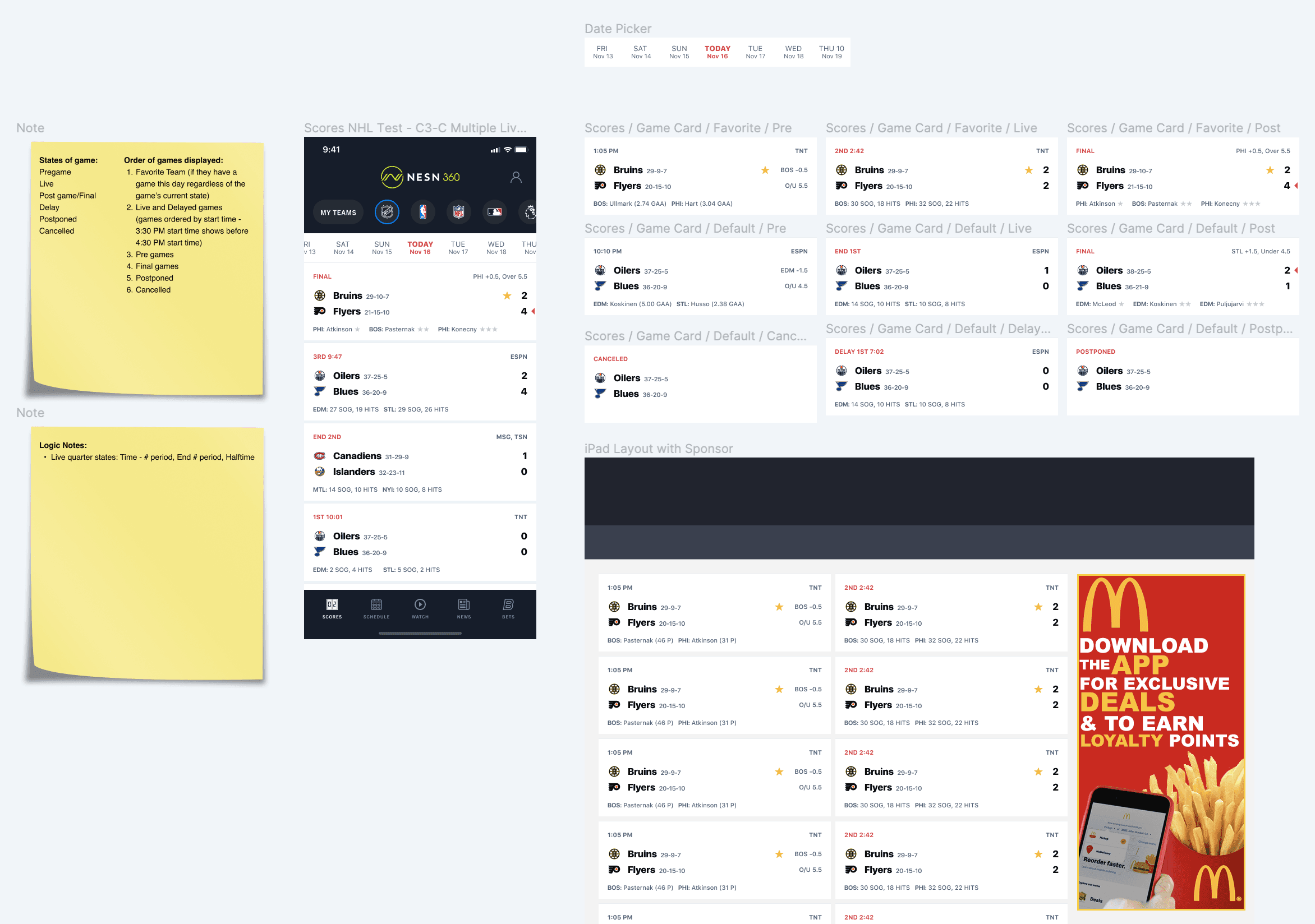
Date Selectors that make sense for its league
Examples of the different date pickers depending on the sport.
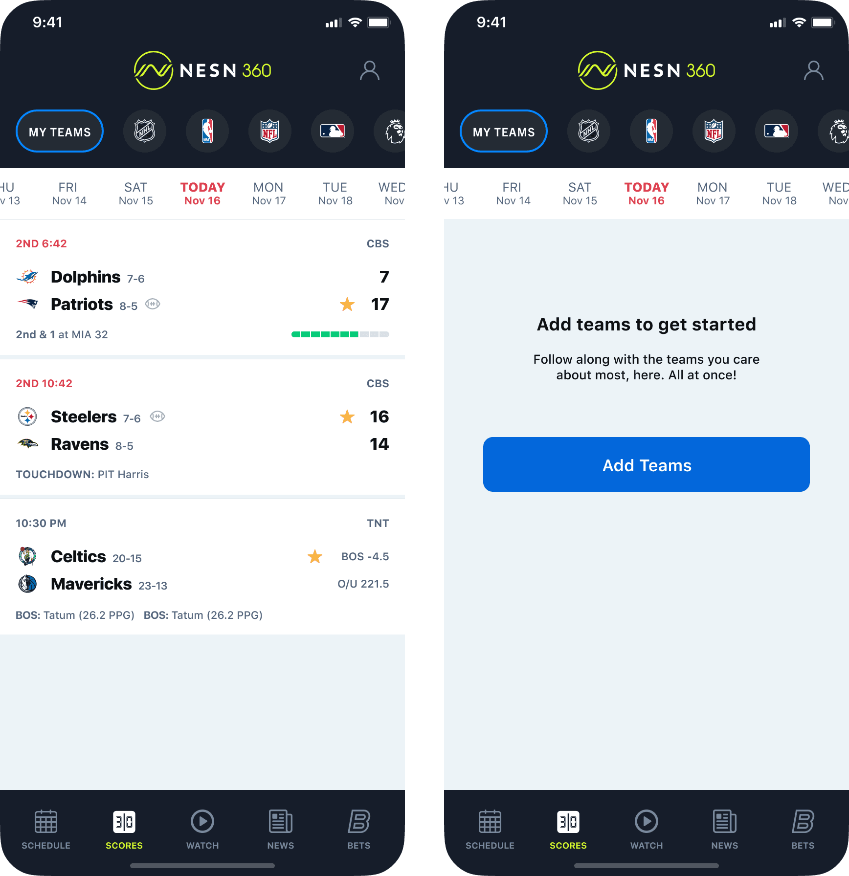
Having a fan select teams to follow can be a great way to increase engagement. It gives them a sense of control and personalization to make things the way they want it.
This provides the user with a quick glimpse of all the teams they wish to follow all at once. However, if the user hasn’t selected any teams to follow – they go to the “Empty State”.
In this case, it’s important to add a way for our fans to add teams to this page by adding a call-to-action, rather than leaving this page blank with no action to take.
Catering to the fan with My Teams
My Teams tab with three teams and the Empty State for when a user doesn’t have any teams selected.
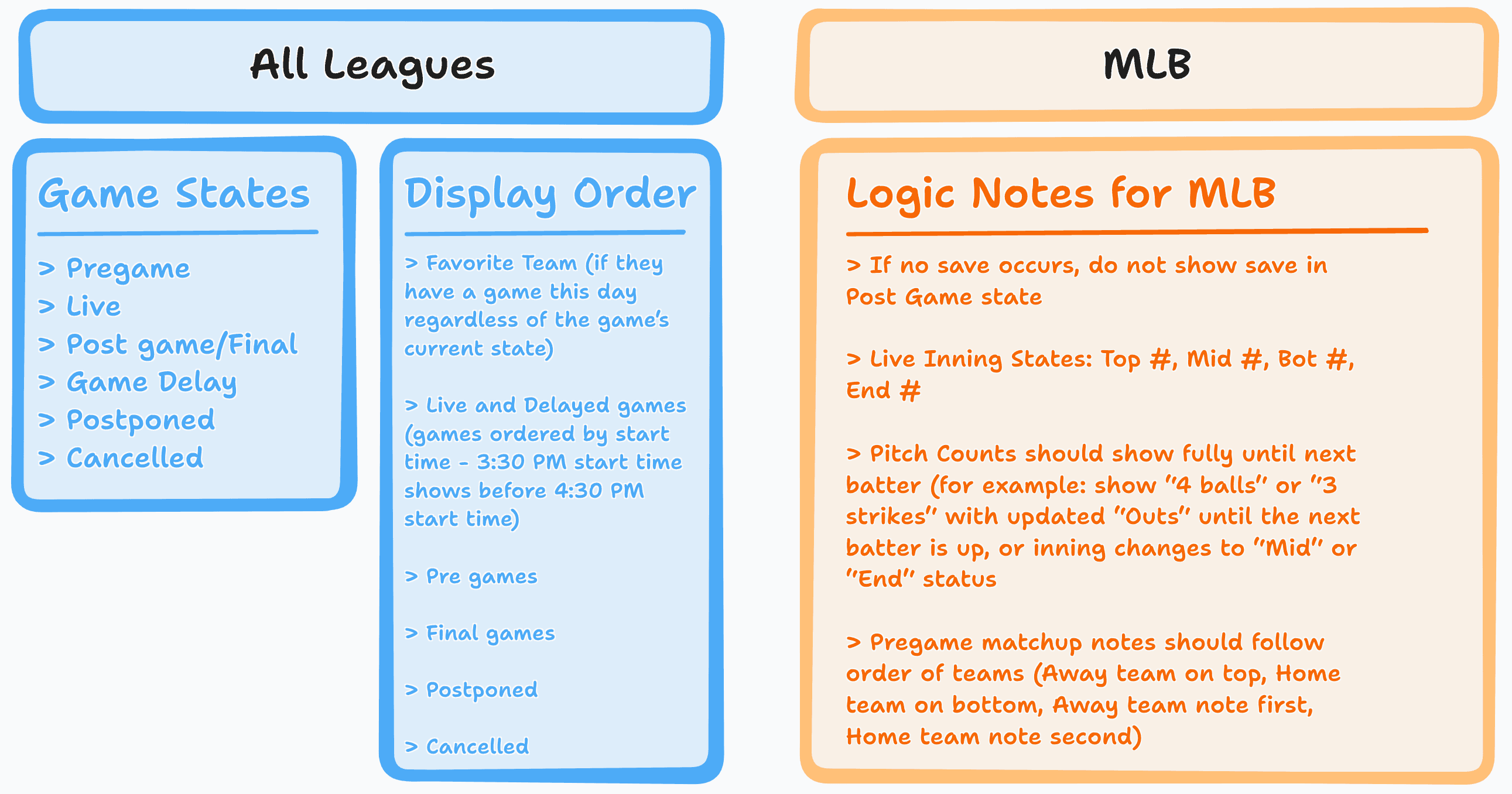
When thinking about the way information is presented to the user, I wanted to make sure we followed a pattern that made sense. Showing someone their favorite teams first is because it’s something specific to them. They chose it, so we can assume they want it.
But, we also had to think about where do postponed games show up in the order, and if pregame states should be shown before another game that’s already finished.
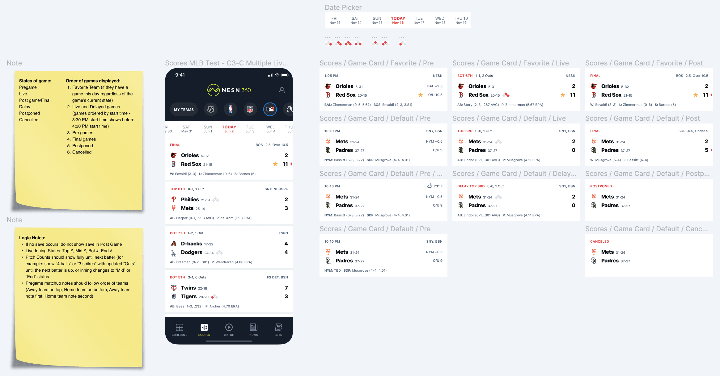
Documenting logic and notes for states and use cases
Examples of a few sticky notes I did for preparing the different states and use cases we would face in this project.
Annotated wireframes for MLB view and scorecards.
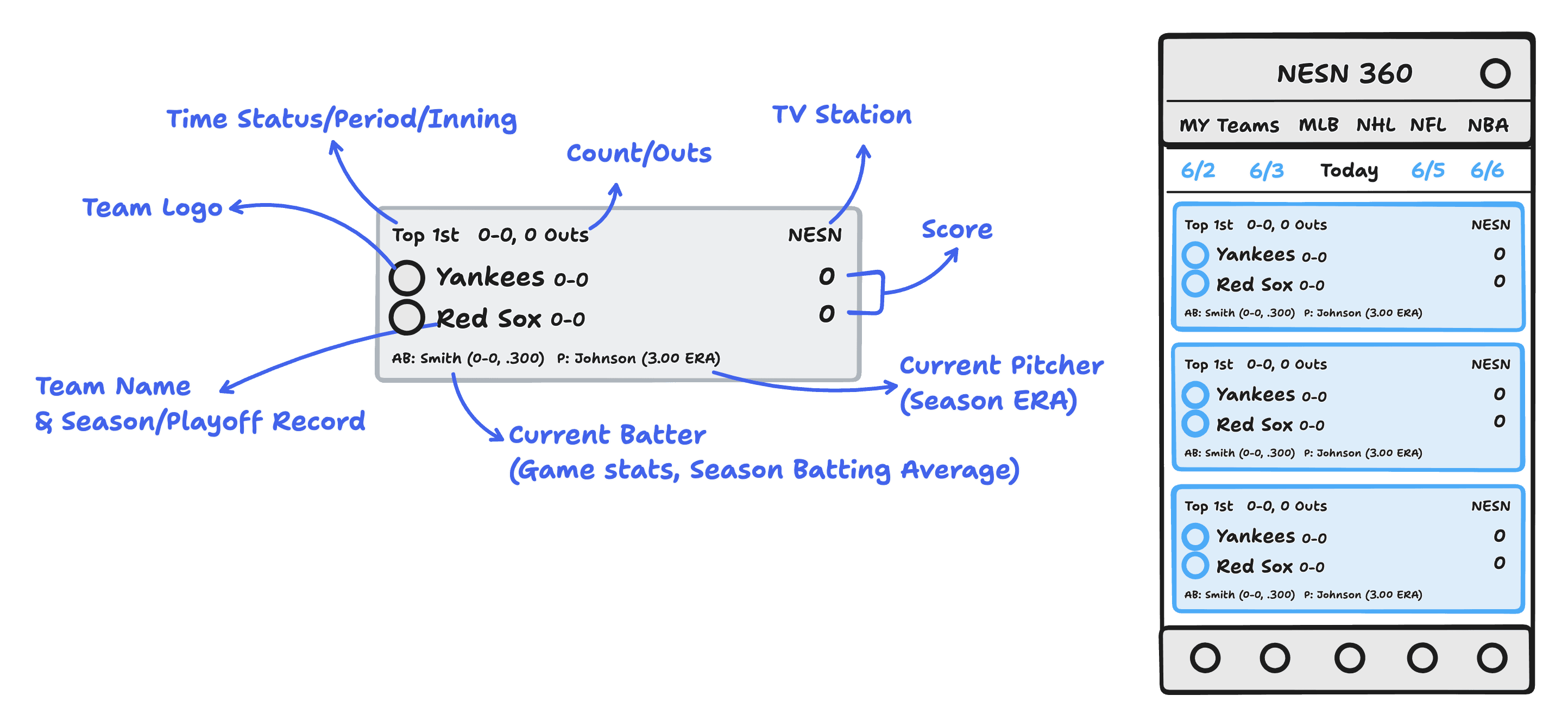
Some of the thought process that went into the UI design.

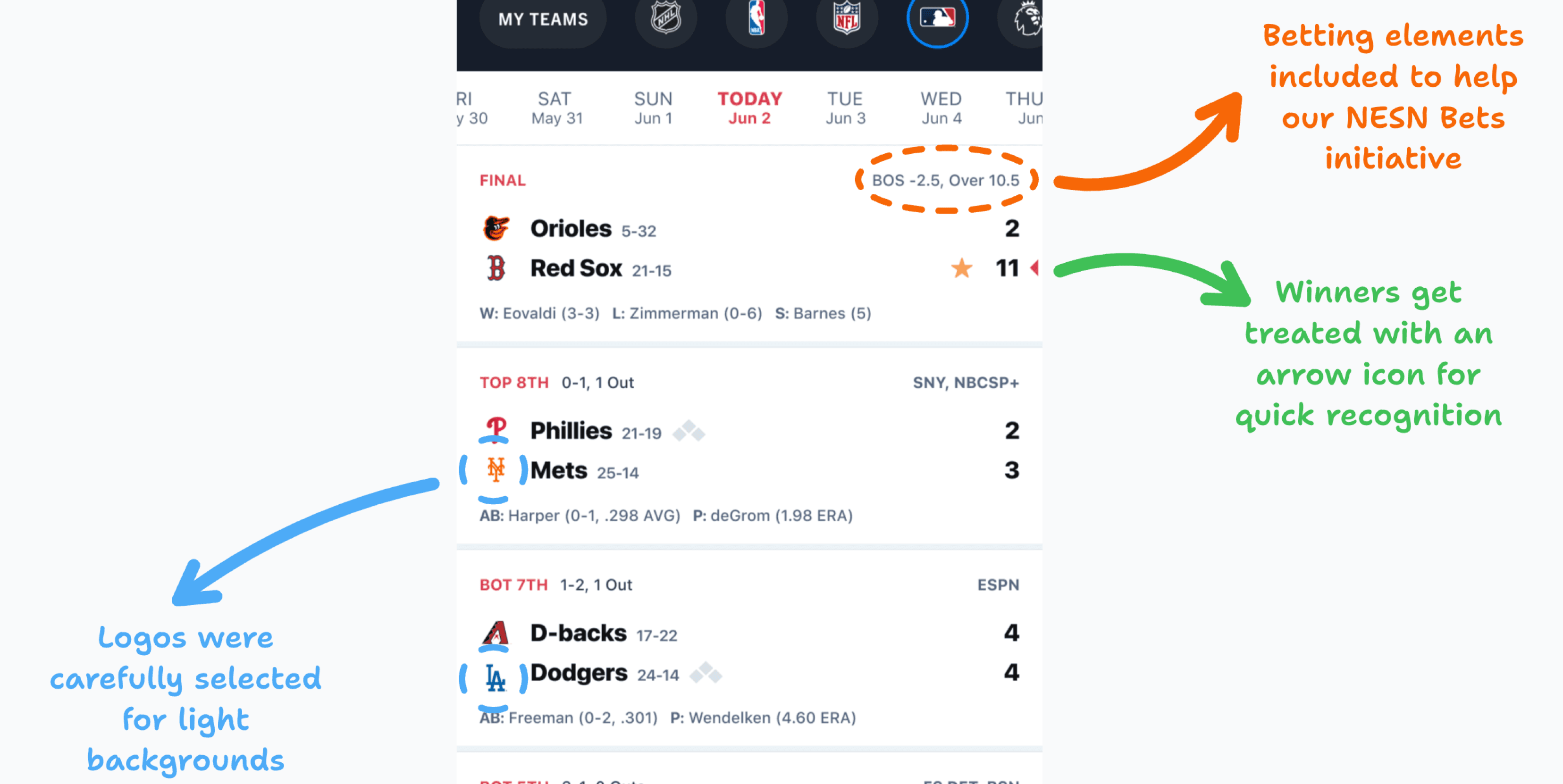

Working Figma board snapshots of some UI and notes during the process.

The new design adds a more branded look and feel, including:
A more user-friendly league selector (especially for My Teams)
A date selector that aligns with league format
Visual alignment between logos and team names for quicker recognition
Play and game indicators that allow fans to follow along with more details
An overall cleaner aesthetic that allows for easier readability for faster comprehension.
Before & after
Screens taken before and after the Scores redesign.