Mobile view coming soon!
Please view this project on a screen larger than 1120px wide.
With the rebrand of NESN to NESN 360, the goal was to create a unified system of reusable UI components, patterns, templates, and overall language as our product suite grows. Not only that, but while working with multiple vendors alongside our in-house teams of designers and engineers – it’s imperative that we have consistency throughout.
Goal: Create a unified visual language for consistent design
Although NESN streams games for only a few pro sports teams, the content ranges most leagues and all the teams within those leagues. If you take just the four major (most popular) sports, that’s 120+ teams with many overlapping city and team names.
Here’s an example of a structure tree that I proposed to my team to help break down components by league and team city abbreviation.
Component Names: Creating naming structures for leagues and teams
Documentation
Together with my team of two other designers and the help of an in-house developer, I led the audit of our existing products across multiple platforms and creation of new components and patterns to be used when NESN decided to rebrand to NESN 360.
This included many foundational pieces like new typography and font stacks, extended color palette, and modernizing existing components to match the new brand.
Overview: I led the launching of our design system
Building off the naming structures – it’s key to know which team to refer to.
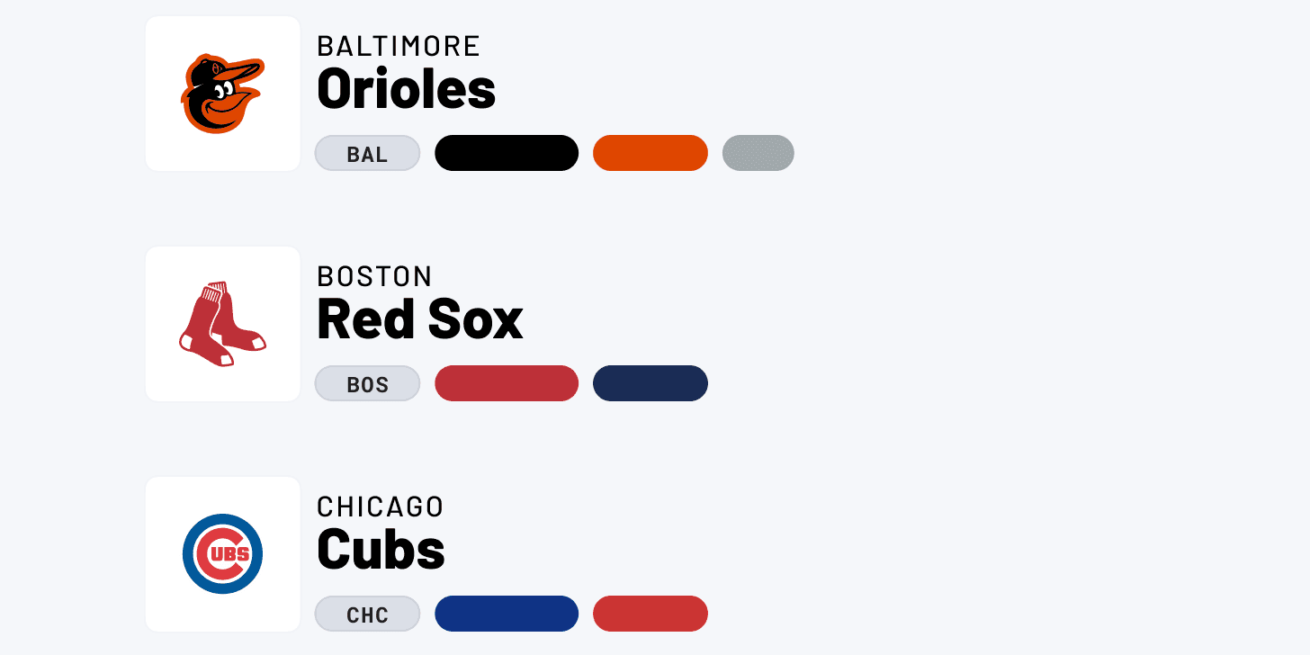
In sports, teams often are abbreviated to their location in two or three letters. This pattern is often seen on scoreboards when watching a game. For example, when the Boston Bruins play the Detroit Red Wings – the scoreboard will say BOS for the Bruins and DET for the Red Wings.
While it’s mostly standard, some cities go by different variations depending on the network. For example, Jacksonville can be abbreviated by JAC or JAX – so it was important to document what we would patterns to use in order to make sure we didn’t have any miscommunication when looking for an element in our Figma library, or for when the engineers were coding. This would be a huge time-waster if we couldn’t figure out the team correctly.
Organization: Making sure we target the correct team on the first try
Prior to NESN 360, there were very little colors to choose from, but the bigger problem was that the font stacks and colors in production were inconsistent from one another. During my audit, I found multiple versions of dark body text that were slightly different from each other (sometimes #333, sometimes #222, or sometimes something else!) – with this inconsistency, it makes it hard to quickly decide what color to use.
Not only that, but our devs were coding multiple classes for the same components in the CSS library, which is totally unnecessary. This included colors and other elements, too. This is bad because it increases the size of our CSS library and slows down the site.
Audit First: Lots of inconsistencies that harmed site performance!
Components
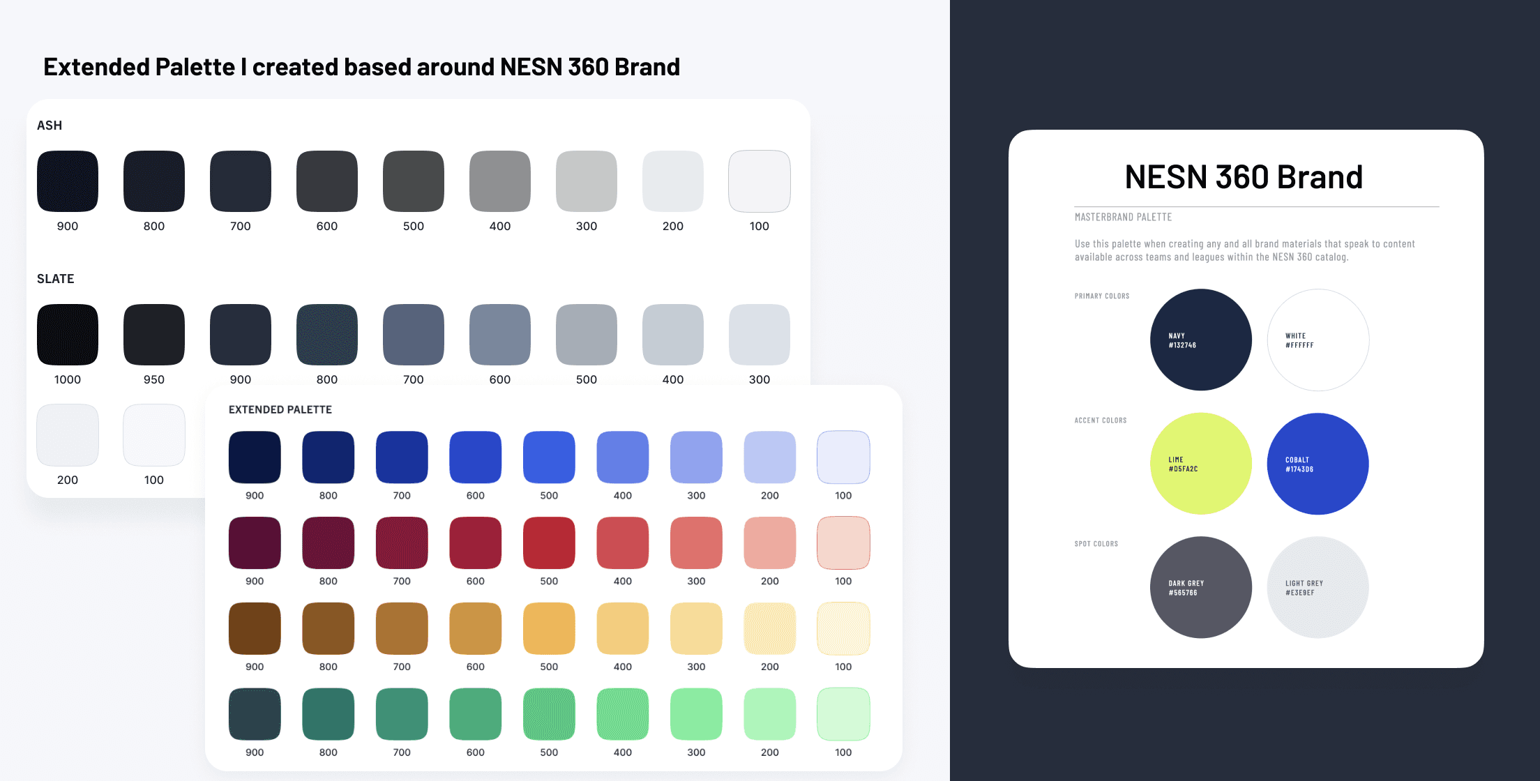
An outside vendor created the NESN 360 brand and handed us the style guide. This was great for branding, but we needed an extended palette for the foundational elements on our website and app products.
Based off the new branded colors, I created an extended set from neutrals to semantics.
I tested colors for accessibility – all colors labeled 500 and higher are accessible on light backgrounds, while 400 and below are accessible for dark backgrounds, unless used as backgrounds themselves.
Creation: I started with the foundational components first
Snippet of the extended palette I created compared to the NESN 360 (provided to me by vendor) branding palette.
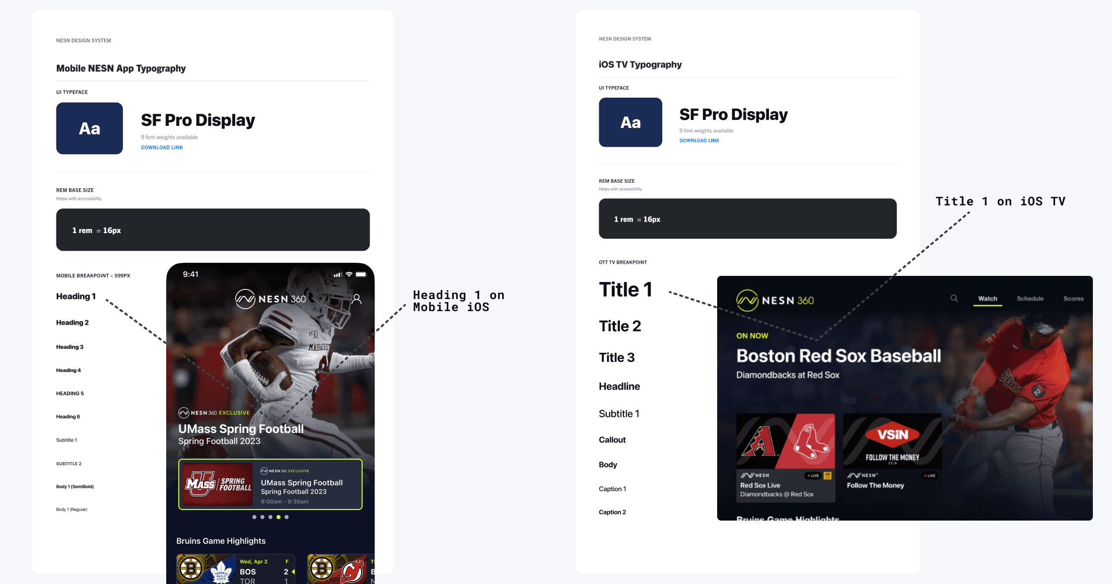
Typography stack for iOS mobile and iOS TV platforms with examples of where it is used.
After the audit, I needed to propose a solution. There were tons of variations for a lot of the components, so the first thing was to scrap all the unused (and sparingly used) components that were found in the CSS library.
Then, I sought the most common versions of the elements by starting with the most heavily viewed and important pages. Like the home page, for example.
After eliminating and condensing the amount of unnecessary variations, we had a fresh slate to start from in order to improve these elements.
Aligning & Fixing: Gathering common elements, scrapping the rest
Lead Designer
Role
Figma
Platforms
Component Library, Documentation
Deliverables
Crafting a design system helped our designers, engineers, and third-party partners collaborate more effectively, design more efficiently, and create consistency throughout our designs on app and web platforms.
Launching the NESN Design System
2021-
NESN
Here’s an example usage of a Boston Bruins logo and a background color container.
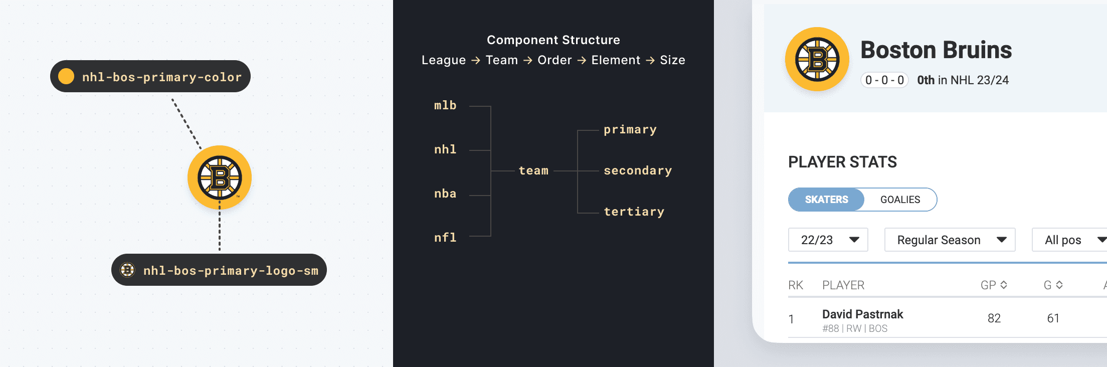
Key Learning: This documentation was super helpful to our devs! Most of our developers aren’t sports fans and are unfamiliar with standard team abbreviation codes, so the feedback on this doc was very positive.
Team panels doc includes location, team name, abbreviation, color stacks, and alt logos when applicable.
MLB Library
Creating a unified system of visual language has already sped up our design process tremendously and has saved us hours from searching old files to find the designs, patterns, and components we need for new designs in order to keep consistency in our products.
The documentation has also helped our engineers find what they need much more easily as well.
Design systems are living and ever-evolving, so getting this launched was a huge first step – but managing and iterating will take just as much, if not more effort!
Reflection: Designing with consistency is now easier than ever
Another important piece for our design system was creating templates and shells for our main screens that have commonly used patterns. We won’t often redesign these screens, but it makes it easy to update them as we iterate on our products.
This was especially important for TV platform designs because it’s much harder to grab a quick screenshot and design over it, as opposed to a mobile or desktop design.
Below is a design pattern template we use for our Account section on FireTV, with auto layout functionality, to quickly add new pages to the side navigation
Patterns: Creating page templates helped speed up design

Template for creating new pages within Account section on TV platforms.
(This gif is small to keep the file size down and keep the clarity in detail)
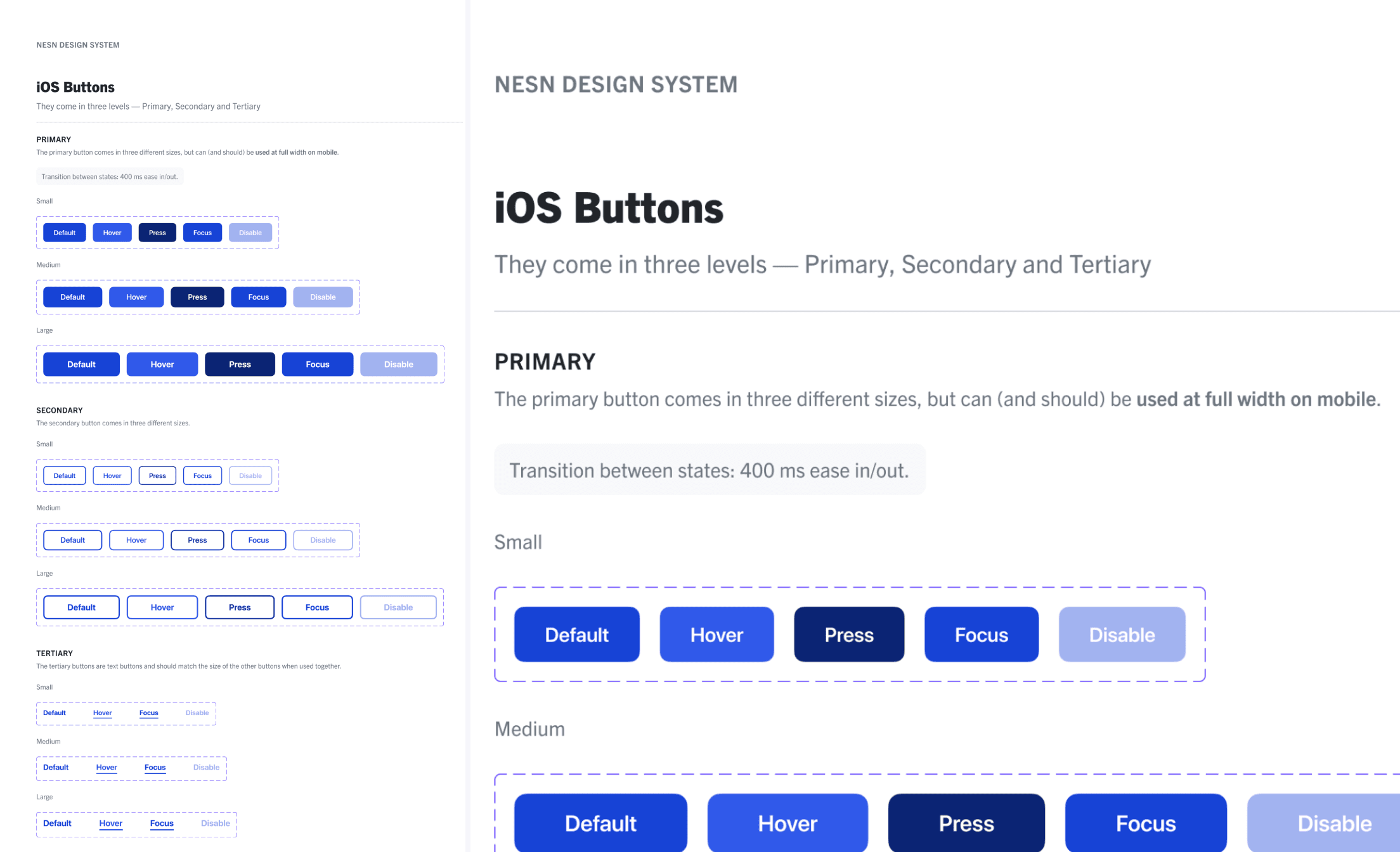
iOS button sheet with different sizes for each of the primary, secondary, and tertiary (link buttons) styles. It also includes states and animation documentation.
Example
LIVE SAMPLE
Try it out ->
Default -> Hover -> Press
For the creation of buttons, I considered the different platforms and different states needed for the buttons.
This includes different fonts for the different platforms, for instance, OTT TV and mobile app platforms use system fonts like SF, Helvetica, and Gotham, while our web platform uses different branded fonts.
States are very different for web and mobile platforms when compared to TV devices. One major difference is that on TV, there is always something in focus, and there is no such thing as a hover state.
Below, I decided to show an example of our iOS button sheet. There are three levels, along with three different sizes included.
Creating Buttons: Multiple states, multiple platforms
